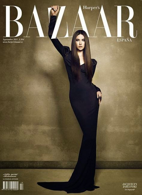
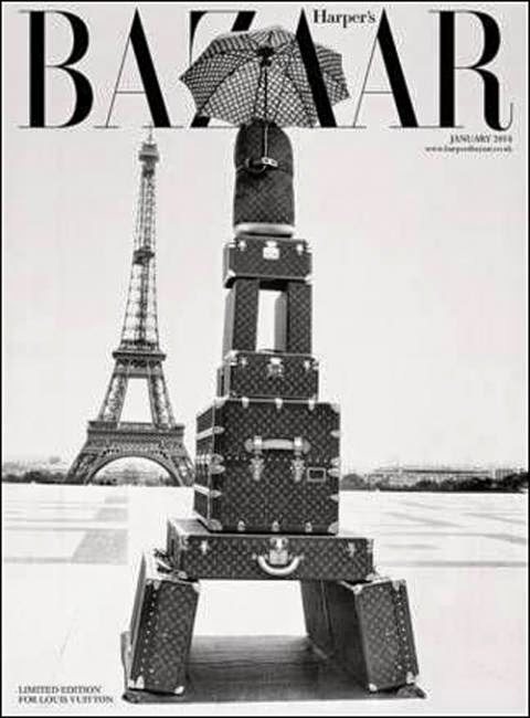
This reasons why I like these Variety magazine covers is that the font is very appealing to my style, the contrasting colours of the background the title and the image and also its originality because I have never seen a magazine cover which has the main image upside down. Also the symbolism on the first magazine cover from the text and the image.
The reasons why I feel these magazine covers are appealing to me is because of there uniqueness and originality and also the simple use of colours in the theme. The cover of the second magazine looks very vintage because of the suitcases, the black and white and also the font. I also like the way the umbrella at the top of the photo overlaps over and under the title making the text look as if it is part of the actual photo taken which is also a theme throughout these magazines because on the first cover it looks like the woman is holding onto the Z in the title which is a very original idea.
These magazine covers are presented in a very precise and detailed layout with everything in the right place. That is one of the reasons why this cover is appealing to me and the other reason is the use of colours in both magazines. The black and the white are very complimentary colours which is why both the title and image stand out. The colours in the second cover are a big mixture of different colour palettes but they does not seem to stand out too much because the plain background makes it more soothing.
One of the many reasons why I like this magazine cover is that how simple and plain it is but at the same time very powerful. Both covers are simple but also very different with the way the title is put inside a box on the first cover but on the second one it is above the image.


No comments:
Post a Comment